
How is colour used when designers are developing concepts for public information?
When designers are creating their images they decide what is the colour they are going to use.. Normally it's involved/related with the logo/theme colour for the company. Or they may be trying to relate to the audience with a certain emotion. Even try to express a certain colour to really show what the photographer is trying to show! A good idea is too create a poster and place it in an area where there are boring black and white posters; this way the poster will stand out.
 Why can colour be so powerful to hook an audience or deliver a message to the viewer?
People become attracted and look at the easiest thing for the eye to look at, so there for making it simple and use one colour will be the most spotted thing in the room. colour can be powerful to the audience; if you add every single colour possible to fit onto one poster, then it may become off putting!

 Red
Red
 The most emotionally intense color, red stimulates a faster heartbeat and breathing. It is also the color of love. Red clothing gets noticed and makes the wearer appear heavier. Since it is an extreme color, red clothing might not help people in negotiations or confrontations. Red cars are popular targets for thieves. In decorating, red is usually used as an accent. Decorators say that red furniture should be perfect since it will attract attention.
The most romantic color, pink, is more tranquilizing. Sports teams sometimes paint the locker rooms used by opposing teams bright pink so their opponents will lose energy.
Blue
 The color of the sky and the ocean, blue is one of the most popular colors. It causes the opposite reaction as red. Peaceful, tranquil blue causes the body to produce calming chemicals, so it is often used in bedrooms. Blue can also be cold and depressing. Fashion consultants recommend wearing blue to job interviews because it symbolizes loyalty. People are more productive in blue rooms. Studies show weightlifters are able to handle heavier weights in blue gyms.
Yellow
Cheerful sunny yellow is an attention getter. While it is considered an optimistic color, people lose their tempers more often in yellow rooms, and babies will cry more. It is the most difficult color for the eye to take in, so it can be overpowering if overused. Yellow enhances concentration, hence its use for legal pads. It also speeds metabolism.
How do your propaganda examples communicate messages through the use of colour?
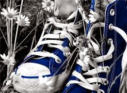
From the colours above and the primary colours, it shows different kind of emotion, and depending on the image, it really relates to the audience without even saying any words. For example, the rose is red and the rest of the picture is in black and white.. this really makes you notice the colour and wonder about the message that the photographer is trying to tell you; Whether there's a story behind the image? Or the really appreciate what a beautiful image it is.


No comments:
Post a Comment