Tuesday 18 November 2014

Final PUMA Shoe Advert


This is my finished project of my advert for the trainer shoe PUMA. All the different layers and images taken, were from my iPad, I did not use any images from online. The background I had painted by using different splats of paint. When I uploaded it I did not think it look as good as it could; so I highlighted different areas and changed the brightness and contrast to make it look more vibrant and happy. I cropped two different images of the shoes out of some images and added them appropriately to the image - I then used the paint tool and painted in some black to give it a shadow effect to make it look like it's on the background. I then cropped out the puma side and made it large - this is here the title will go... After I decided how to make my title I wrote out 'PUMA' in text and then clicking on the puma side layer I cropped around the text. After I had done I added in shadow and took out the text.

If I could improve anything, I would tidy up the title and maybe rotate it/make it more rounded. My favorite part is the background as I think it gives it the type of feel the trainer gives, like a layed back feel; it is layed back because the paint looks quite messy, and it doesn't look like much effort has been put into it. 


Friday 7 November 2014

Still Life Photography


I like most of these pictures I have taken, I think the outside ones worked the best.. I feel like i needed to work with a stronger light in the inside one as i feel it made it look a bit blurry! I think the outside ones look most creative as i have different and interesting settings/backgrounds. i think next time i will try different angles inside as i felt like they were a bit boring and similar.


Tuesday 21 October 2014

Analysing an Advert


Converse Advert.


The function of an advert is to promote a certain product to a target audience, it can be a poster, a tv advert, a billboard ect. this product is a converse sneaker.. I like this because it's not a common advert since it doesn't involve a picture of the product. i the advert it shows a wall full of graffiti, (which shows the target audience is teen,) and on the wall it says 'SHOES ARE BORING WEAR SNEAKERS - CONVERSE' this is bold ad yellow, obviously to stand out! This tells me it is they are advertising their sneaker brand, so this looks like a message of one of their new shoes, trying to catch the eye of teens and this is why it is made in graffiti. The text is very bold and in captitals, a colour different from the rest of the picture, (which is in bright, vibrant colours,) meaning it is standing out, telling me it's an important message. This reflects to the products style because it is a very street style, and you would find graffiti around the streets. The theme of the advert is graffiti and teenagers; it looks like a clear message being told. The elements of this picture that would attract the audience would be; the colours, the capital bold text, and the fact that it is in the street or any one to see. I can identify how they made this image.. It is what it looks, a street artist has probably sen paid to do this work and then a photo was made, it is not only an advert by putting the picture anywhere, but also to the people who are walking past. For the visual effect I will use in my trainer campaign I will try to give it a creative look.

Friday 17 October 2014

Evaluate & Comparison of Photoshop and Illustrator


Photoshop and Illustrator are programs that design so, so many people in the industry would want to use this since many posters, magazines, tv adverts/programs and more.

Lots of people would use photoshop like; fashion designers, they would need to enhance the clothing and edit the models to make them suit the ideal look of what they're looking for. Photographers would put effects of their photo, and for example if it was of the moon, maybe they would make the moon bigger. Animators, they can easily use the animator workspace in photoshop. Photoshop works in Pixels, meaning different tiny squares the program works off, so if you zoomed in on your work the image would become very pixelated and blurry.

Illustrator; Graphic designers, to show off the different text they can use and drag it wherever they want. Commercial printer would use this program for their superior quality when printing. Tech communicators, so that they can work with the different shapes to create what they need, and it if very flexible for them to work with. Illustrator works in Vectors, which means it works with the images quality, and doesn't get blurry when you zoom in. 

Both programs are similar but also very different. I used photoshop to add on different layers and edit the image, like make things bigger and smaller, enhance a different area of the image. you can drag and drop different images onto others but also blend it in. And in Illustrator I created different objects images out of the shape tools and layers I can add, this gives in a very cartoon effect, but the results are good. I have learnt that Photoshop is more of a realistic program, used for more of the editing jobs, with all the blending tools; And Illustrator is a very rough program mostly used for designers when they're designing, for example, designing a car..

I have gained a few ideas in the creative media, like taking your time when creating your work. in photoshop i would use the program for editing photographs and blending two unique photos together. Illustrator would be great for planning, like a house design and car design ect.
I like the different available uses in photoshop like the options, if you clicked a shape tool you'd get many options of what kind of shapes there are. In Illustrator I like how simple it is and how easy it is to zoom in and out and clearly see what you're working with! Creating text is very easy and clear, with all the different fonts you use.

The many advantages of the Photoshop program would be how good the finished product of your work looks,  when you can easily touch up what you can do,  another is, if you know what you're doing, you can do pretty much anything within using photoshop.
In Illustrator it is a very simple program and quite easy to work out. It is very flexible when moving around different objects, and shaping different things. Although both programs are very clever, they can have negatives. For the first example; Photoshop, when you open photoshop and all the tools are in a row, half the time, many people don't know what they are for, and what they do... It is not very straight forward since there isn't a tutorial with everything you can do on the program. 
For Illustrator the draw back is probably how you have to use the shape tool in most things, and if something is out of place the hole image can look wrong!

In photoshop I would like to learn how to fully use lot of tools to create a unique image by editing a photograph. And illustrator, what else you can do other than deigning. 
I defiantly feel more confident to try out different tools, on my own when creating an image and try to come up with an original idea of my own. I would also like some workshop though for I don't fully understand all the tools.


Tuesday 14 October 2014

Timeline


 Step by Step.. 
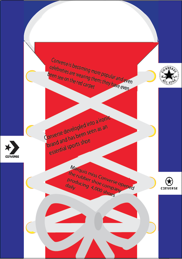
I used illustrator to work and create my timeline, adding the different layers. I used the shape tool and dragged each shape into place to try and recreate a converse shoe. I added text and rotated it to fit into place. The to finish I used the paint brush tool to smoothen out in some places.


This is my finished work.. 
I have chosen the brand Converse for my project; so i have designed my timeline in the shape of the shoe and added different information next to the different logos. I like the way I managed to add all the different layers, and the way the shoe laces cross over! I think I did it quite creatively, giving the different shades of colors, like the white and grey. I have used the colours of the latest converse shoe logo.


My Poster..
This is my poster and used Photoshop to add in my timeline into one of the rooms in the branding and advertising museum. I'm sure this poster would attract the younger audience, because most teenagers wear the brand converse as a shoe, they may be interested in the different logos they had, where as some adults may be interested in the information of it all!


Next steps..
Next time I can maybe curve the sides of the shoe, and maybe shade one side a darker colour to give it a 3D effect. I can add in the dates on the shoelace of what year I'm writing about. I could even incorporate a picture of shoelaces and composite them onto the shoe!


Monday 13 October 2014

Peer Assessment


This is Natalie's work on Illustrator; I can clearly see that she has chosen Converse, and has shown all the different logos, she has made it as a skateboard style; with the ramps and skate board in the middle! I like this idea because it links with the style of the shoe, which is mainly aimed at teenagers. She has defiantly made this a creative project as she has designed the skate ramps with the tools in Illustrator! Next time she could add in what time period each logo was used.

Sunday 12 October 2014

Adobe Illustrator google image

 
This image was made on Adobe Illustrator. I like how it shows different text showing quirky things, although incorporating the different colours. The pattern looks like shards of broken glass, showing the layering underneath. Its quite abstract, and reminds me of a pop culture poster. It's one of those images where the more you look at it, the more you can see, drawing the consumer in.
I can imagine it on a billboard at a train station, where people are looking at it trying to figure out what it is.

Step by Step & Self Assessment


 These tools in Photoshop helped create my finished piece. I collected many pictures from the internet and dropped them into Photoshop;                                                                                                                                                         Created the layers to add a new image onto it                                                                    Pressed 'cmd' then 'i' which made the new image disappear                                                        I used the paintbrush tool to recover the image                                                                          And lastly changed the colour to delete the outside which made it then look like it was part of the main picture.                                                                                                                              .                                                                                                                                                                          This is my Erik Johnansson inspired piece using photoshop. I tried to do something not too weird, but original. I like how I used 'gymnastics' balancing on the 'Golden Gate Bridge' for this picture. And even though the pictures aren't of the best quality I think they blended in well! 
Next time I would try and add time to make another image.

Sunday 28 September 2014

Visual Branding


Visual Branding


The Converse Logo is well known as a famous shoe brand, this logo is always printed on the shoes or any product they produce. It may not be as famous if it wasn’t printed on the products because you wouldn’t see it or notice it as much; and not as many people would buy it.

The target audience would be any age from children to adults, as they make mainly any size, but I’m sure they are mostly targeting teenagers as this type of brand is ‘ALL STAR’ which means some one who stands out from the rest, in a group or team, i.e someone whose into sport. It is a simple but affective logo using a large star in the middle, followed by a circle as the boarder in a stitching kind of style. I like the colours as they are not vibrant but they are a good blend in colours. If there is anything I could change is probably the layout and maybe change the shape instead of a circle!


The Costa Coffee logo is well known for it’s small cafĂ©; selling mainly Coffee hence the name. it is a good logo as it shows the date it started which can bring in people as they may like the idea of experience, which means they would expect it to be good! I like the colour of this logo as it is mostly maroon and white but it stands out because it is bold. I think the target a wide range of people maybe from young teenagers up. The picture on the logo is of Coffee beans, which is good because it relates to the whole theme. This brand also prints itself onto all their takeaway cups; a bit like the idea of ‘Starbucks’ if there is anything I would change would probably be the colour, as I think it could be so much more eye catching and the colour seems a little old fashioned.

This is the McDonald’s logo for their fastfood restaurant, this is mostly targeted at younger children as their famous character is Ronald Mcdonald the clown, which children may like the idea of. The colours they use are red and yellow, commonly thought of as the fries and red box. I think these colours are getting old as the interior of the restaurant is becoming more modern, with the natural colours and they’re loosing the theme a bit, so I would improve the colours on the logo. I would also change the clown, as because he has been around since it has started, he is reminding people of horror movies, which would not bring customers in. This logo is seen on the happy meal boxes, which are targeted for a younger audience because of the smaller portion in food. On the box they turn the famous ‘m’ into eyes and add a smiley mouth underneath